Inspired by the observation that ARTE gathers and curates all of Europe’s culture, London’s Superunion developed a brand idea and broadcast package positioning the Franco-German television network as Europe’s cultural magnet.
Superunion: “Since its creation in 1991, [ARTE] has stood for cultural diversity and multilingualism, offering high-quality programmes to 60% of Europeans in their native language.
“Our brief was to build a connection between the channel and a younger audience, without alienating its established viewership.
“We worked closely with Cécile Chavepayre, ARTE’s creative director, to develop a strategy that brings unity across the brand in a flexible system.
“Combining magnetism with art, we created a visual identity that reimagines the ARTE logo as a magnet. Text and various objects are pulled across the screen in the idents, promos, and stings to draw in a viewer’s attention. The perfect morsel of entertainment in between shows.”
Image may be NSFW.
Clik here to view.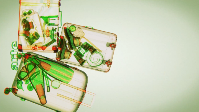
Image may be NSFW.
Clik here to view.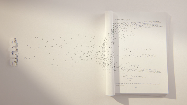
Image may be NSFW.
Clik here to view.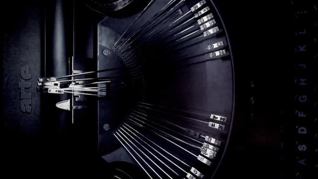
Image may be NSFW.
Clik here to view.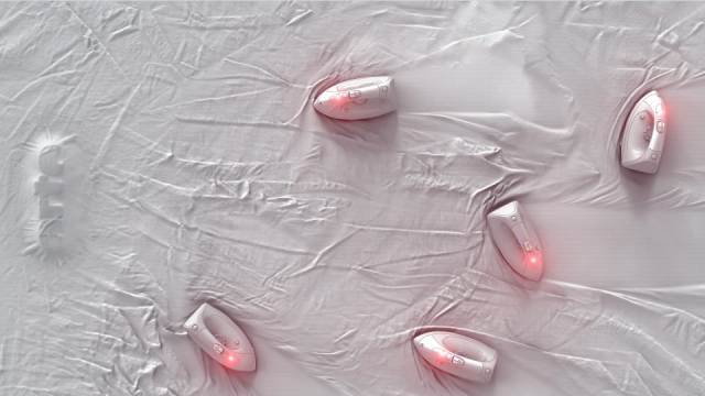
Image may be NSFW.
Clik here to view.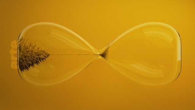
Image may be NSFW.
Clik here to view.
Image may be NSFW.
Clik here to view.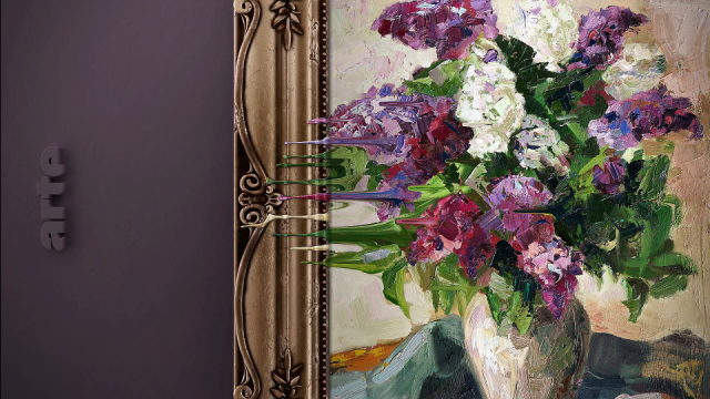
Client: ARTE
Production: Superunion
Image may be NSFW.
Clik here to view.